NOMAD PACKAGING
With the commitment of prioritizing design & quality above all else, Nomad Goods’ entire product lineup is created for the 21st-century nomad. One of the most important aspects to the company is to build all of their concepts from the ground up using the highest quality, longest-lasting materials available.
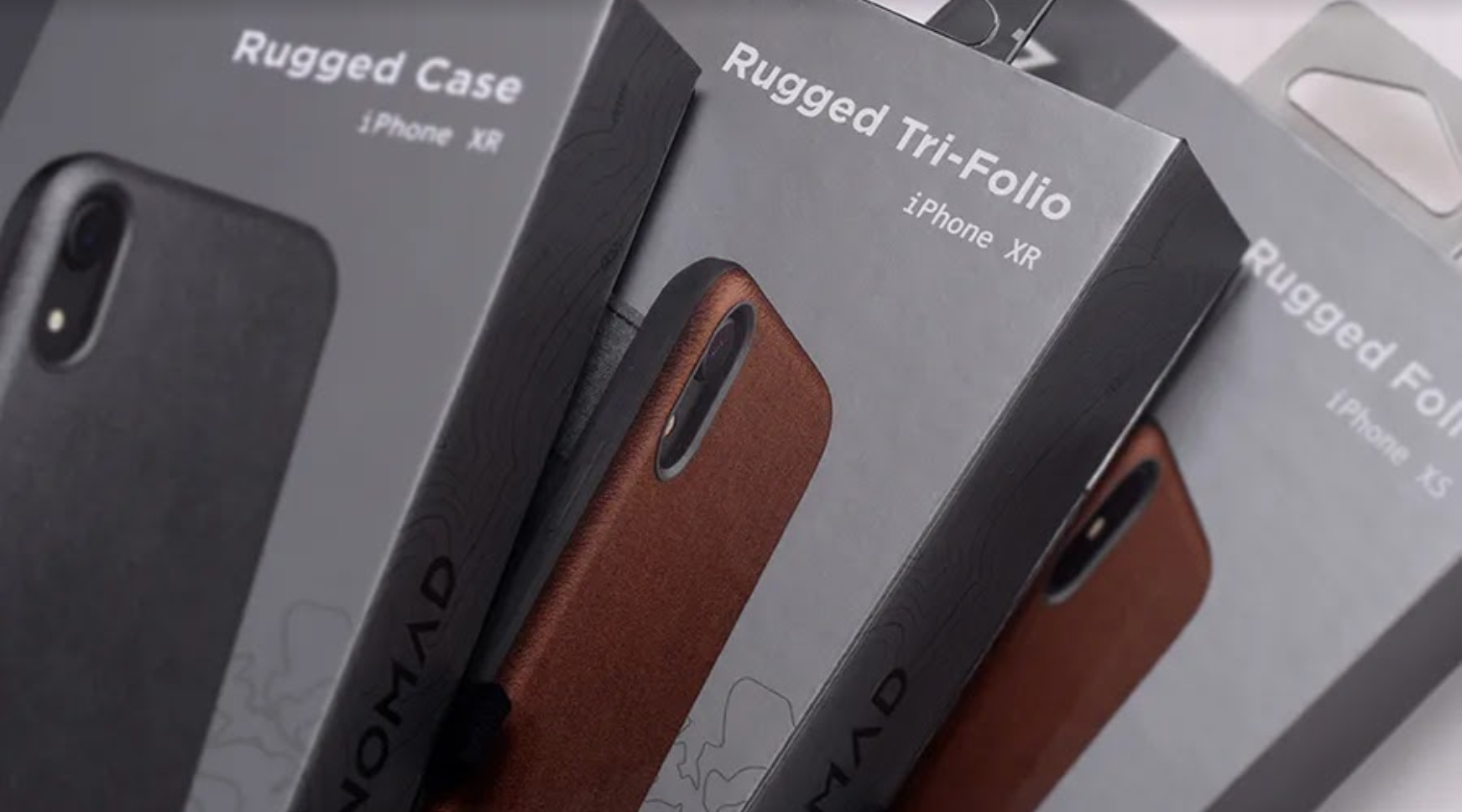
I was given the task to design elite packaging for several Nomad Goods products. Over the course of the internship, I successfully implemented the cohesive, protective packaging across six product sectors.
Scope:
Brand Identity
Illustrative Identity
Packaging Design
Sources:
Images sourced from the internship
Website: nomadgoods.com


BRAND IDENTITY
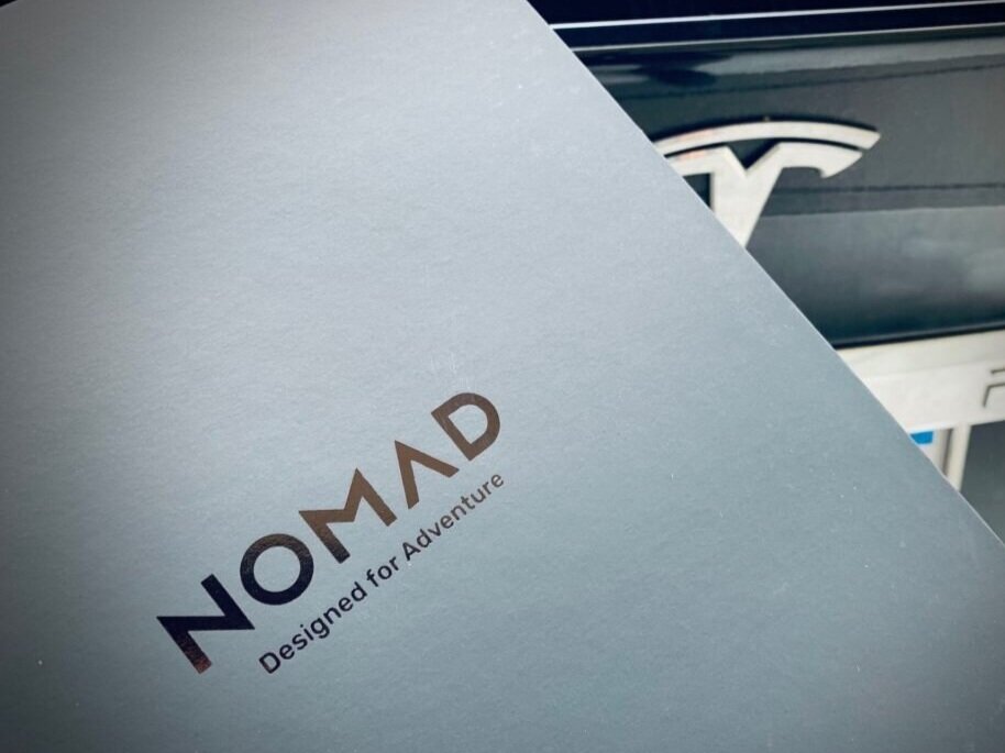
Nomad Goods is located off of State Street in the heart of downtown Santa Barbara, California. Its iconic location — surrounded by the San Ynez Mountains & Pacific Ocean, along with the company’s slogan, “Designed for Adventure” — provided the inspiration for a modular, illustrative brand identity.
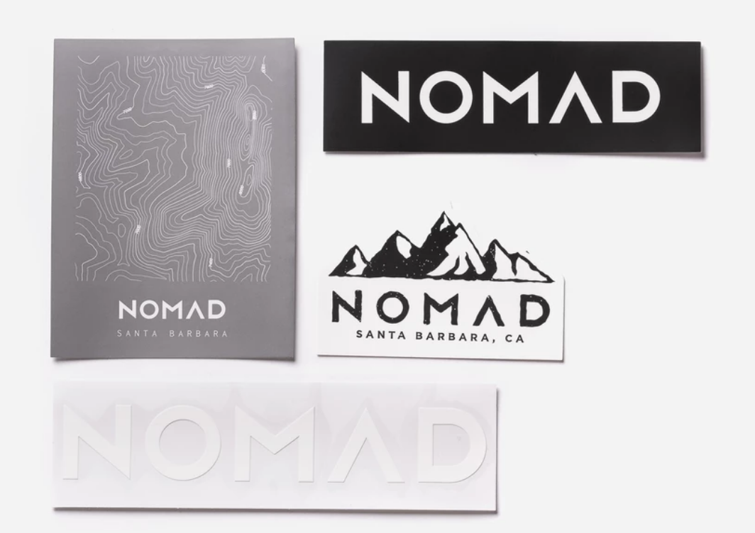
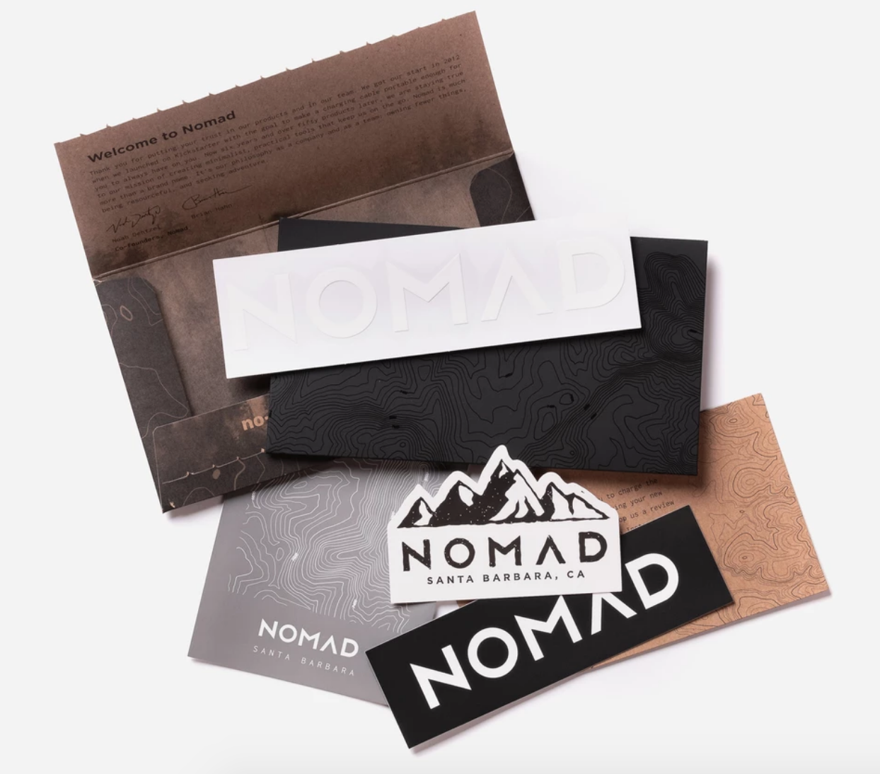
Sticker packs were included with each purchase to help further develop the brand.
ILLUSTRATIVE IDENTITY
The backbone of the illustrative identity is based on California’s famous topography. Its rolling hills and steeply rising mountains act as the framework of the graphic system that supports & incorporates other illustrative elements to tell a broader story of the design philosophy & brand name.

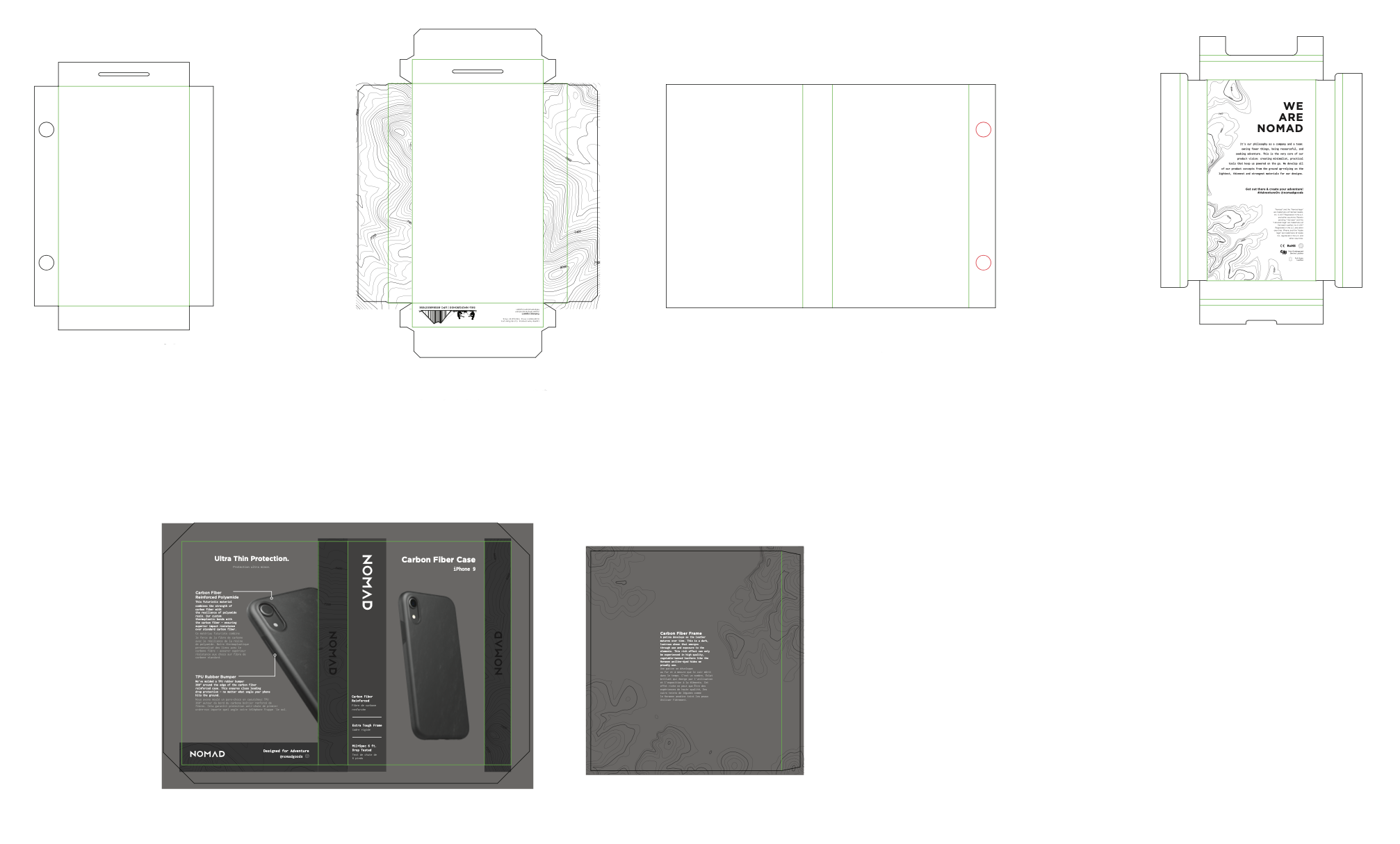
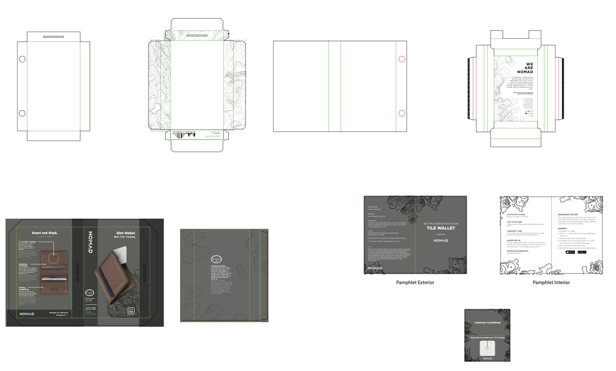
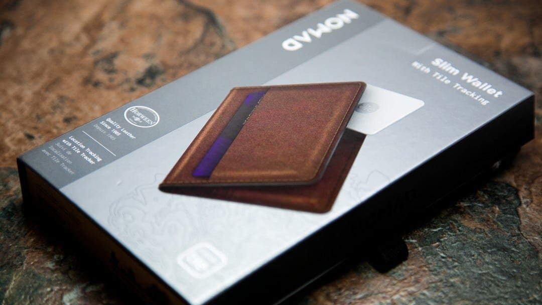
PACKAGING DESIGN
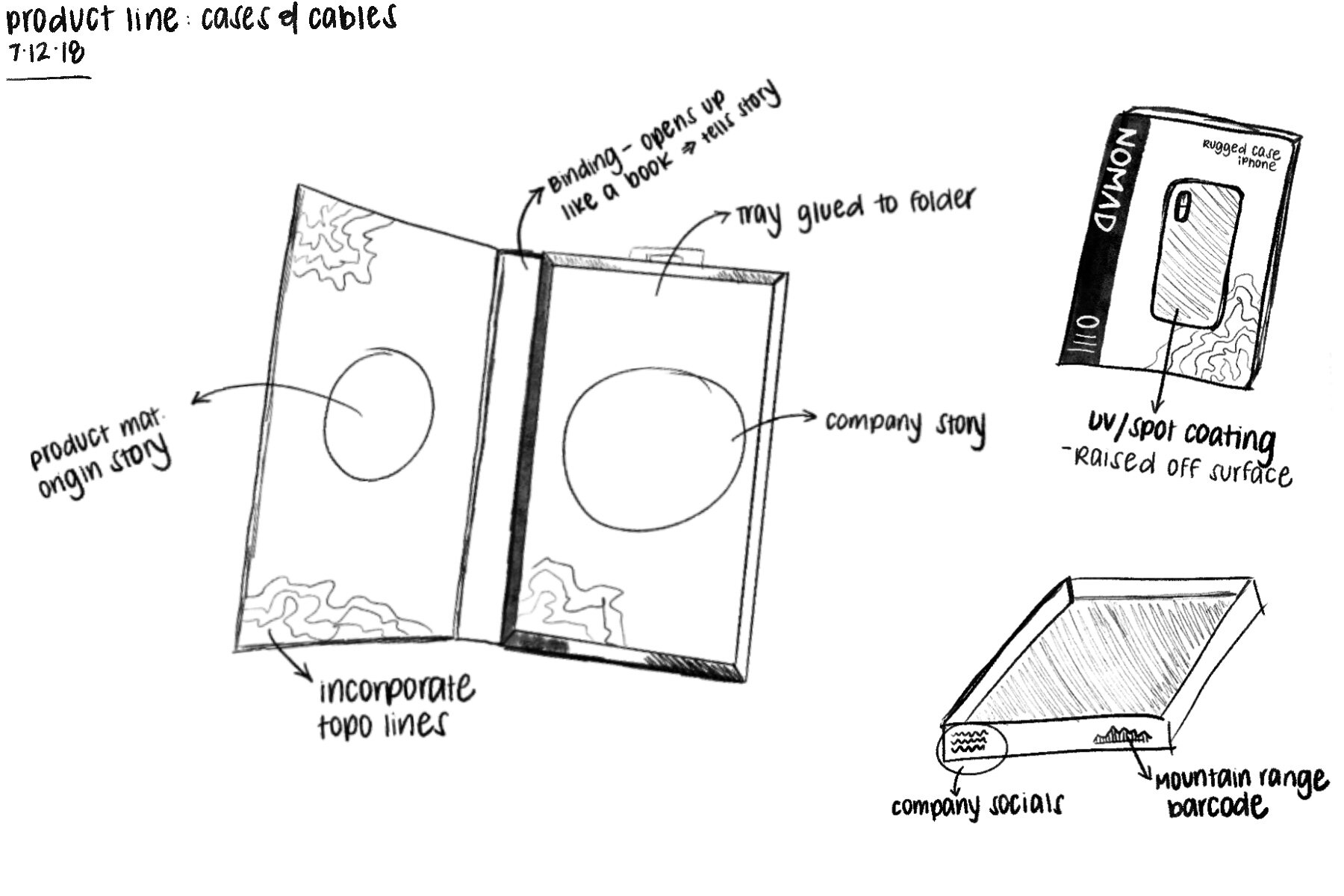
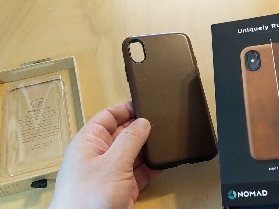
Clear, informative packaging was crucial to explain the technology & functionality of the Nomad product to consumers for retail & online sales. Renderings, iconography, & brief text were used in packaging this project to highlight the main product features.
The packaging structure ranged from telescoping tray styles to elaborate one piece folders. I worked alongside the industrial design team & packaging vendor in Shenzhen, China to produce prototypes to test the form, fit, & function.
DESIGN PROCESS
1. PROJECT BRIEFING: Reviewed old designs to pull similar concepts, but with different materials to reduce tooling & manufacturing costs.
2. CONCEPT SKETCHING
3. MATERIAL SELECTION: Weighed the costs & benefits of various coatings & materials.
4. INITIAL PROTOTYPE: Created renderings & worked with vendor in China to produce prototype.
5. QC TESTING: Conducted the form, fit, & function of the product & package. Conducted an internal focus group using team members to see how they interacted with the package.
6. REVISIONS: Received samples of several coatings & laminates. Conducted an informal internal sensory experiment to see if team members were able to discern a difference.
7. PRICING & SOURCING: Settled on the final selections of material because of the environmentally friendly features & was comparable to the more expensive alternatives for 3/4 the cost.
8. FINAL PROTOTYPE
9. FINAL QC TESTING

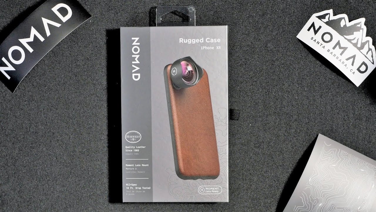
OLD PACKAGING
Prior to rebranding/redesigning
Structural Style: Fabric pull tab helps pull out tray. Drawer tray & sleeve design.
Material Selection: High use of plastic - thermoformed trays & molds, cable ties.
Graphics/Coating: Graphics fed into the brand’s theme of “rugged” to display the durability of the product. Use of dirt made the image look dirty & busy.
Color Scheme: Not cohesive. Original logo used three shades of green. Neon orange accent iconography. Primary package using black caused product photos to blend in.
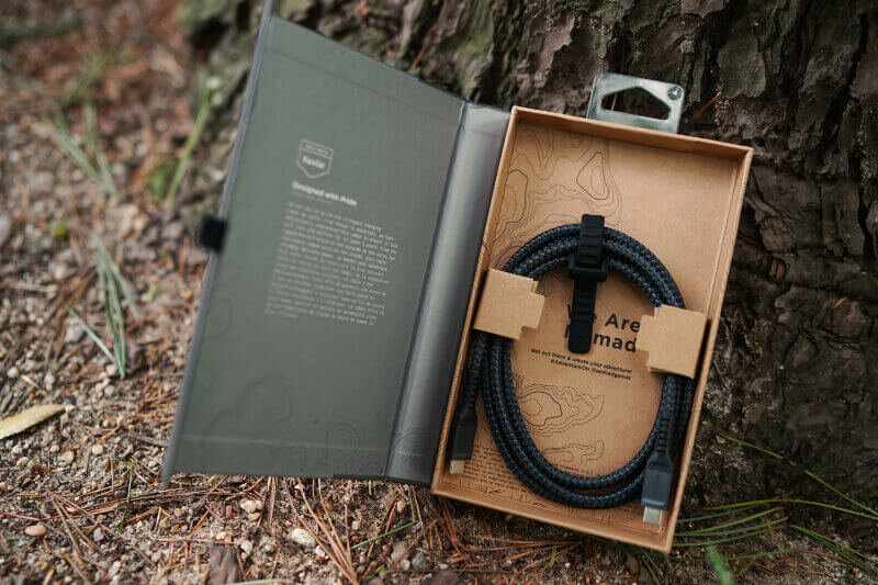
NEW PACKAGING REDESIGN
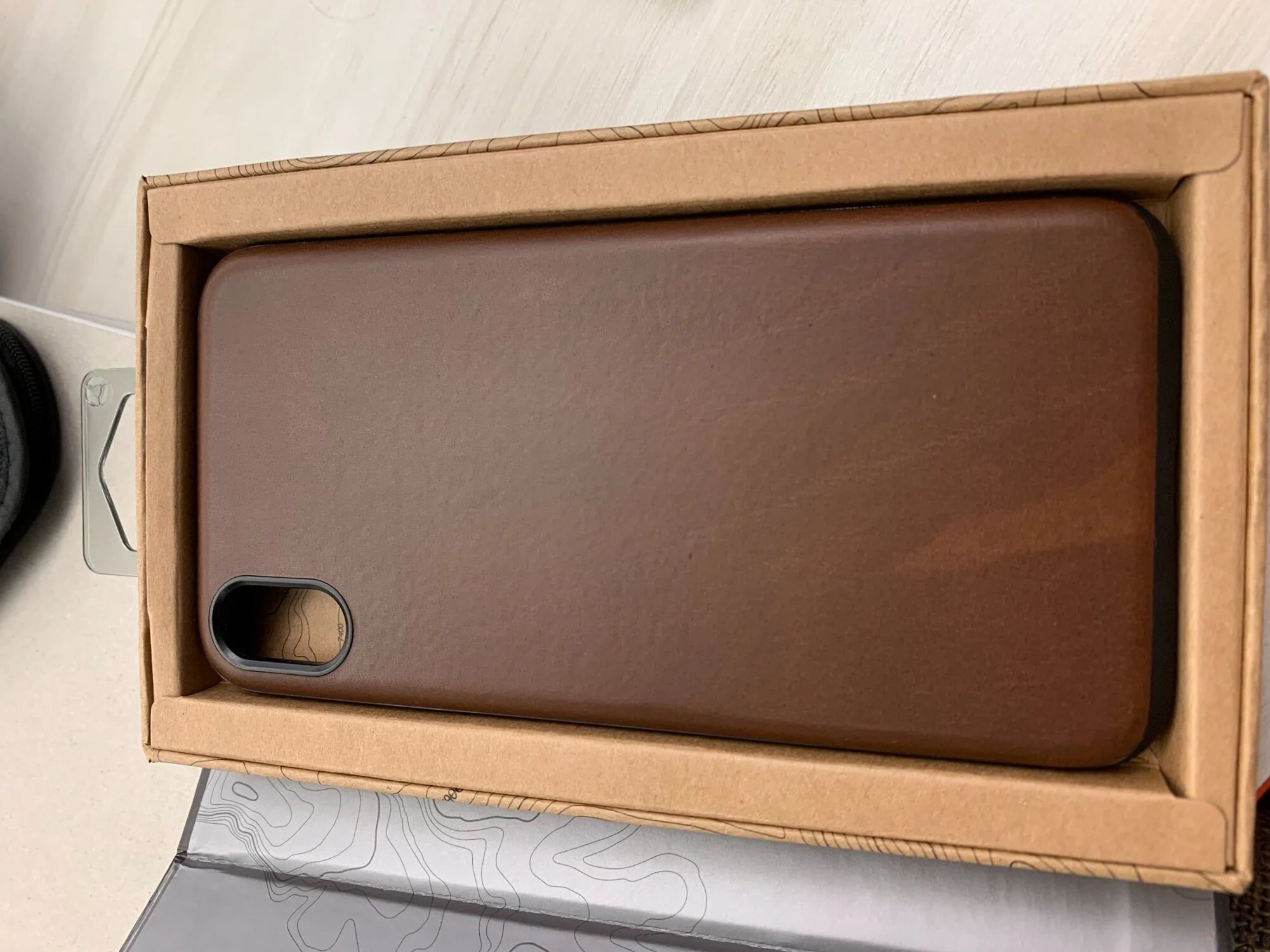
Structural Style: Tray & five panel folder hybrid design. Opens up like a book to tell a story.
Material Selection: Minimal use of plastic - only source is the retail hang tab. Packaging uses corrugated board, Kraft paperboard. Kraft cable ties swapped out with plastic cable ties. Trays reduced in size to fit around the cases = reduced amount of material.
Graphics/Coating: Implemented California topography lines across the packaging. Company’s slogan “designed for adventure” used as inspiration.
Color Scheme: Minimalistic. Product photo stands out more.